Creative Review: Fox’s updated brand features a chunky new abstract logo
New York studio Trollbäck+Company has overhauled Fox Entertainment’s visual identity – but is its new geometric look enough to set it apart from streaming competitors?
It’s been interesting times for the entertainment company this year, with Disney acquiring 20th Century Fox in March – a move to reclaim the missing Marvel characters – and Fox Broadcasting spinning off, becoming independent, and renaming itself Fox Entertainment. So it’s understandable that an updated visual identity was in order.
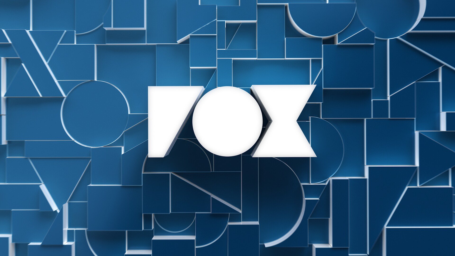
The Fox logo has undergone a subtle redesign, with a chunky new version also created for animations, which show the original logo morphing into the geometric version. According to Trollbäck+Company, the studio reduced the updated mark down to its core components, broke it apart, and then used the pieces as abstract shapes and patterns across the entire rebrand. These ‘broken letters’ will be used in patterns and ‘creative framing’, and play a role in everything from social media posts to huge billboards. The updated identity – which Fox is calling a ‘brand evolution – will now appear across the 17 stations owned by the entertainment company, as well as its 100+ affiliate stations.
According to Alex Moulton, Chief Creative Officer at Trollbäck+Company, the work is intended to position Fox as “an entertainment brand that’s forging culture”. The studio’s Executive Creative Director, Elliott Chaffer, adds, “The way the industry is today, the middle of the road is the best place to get run over. We needed to bring back and champion the brand’s ability to take big swings and bigger risks.”
Read the full article here.